This post has been written by Paulami Ganguli. Paulami is an associate at Daswani and Daswani Law Firm. She practices in IPR domain and is particularly curious about trademark laws. In this post, she analysis a well established principle of Trademark Law with respect to a new judgment of Calcutta High Court. You can contact her here: https://in.linkedin.com/pub/paulami-ganguly/70/9a8/779
Background
“They should not be placed side by side to find out if there are differences; rather the mark should be taken as a whole.” This landmark judgment, followed by many others, has taught us that while comparing two marks to judge if one of the marks is deceptively similar or not, meticulous comparison is not needed. That is to say, they shouldn’t be compared letter by letter and syllable by syllable but have to be taken as a whole.
So the question now arises is, while comparing two composite marks is it fair to place them side by side and literally spot the differences or similarities? Is that not directly in contradiction to the well-established principle of no-meticulous-comparison needed? This question arose in my mind after I read this recent judgment passed by the Calcutta High Court. (Hawkins Cookers Limited vs Khaitan Pressure Cooker Pvt. Ltd on 10 April, 2015)
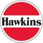
The facts of the case are pretty straightforward and simple. The plaintiff and the defendant both are manufacturers of pressure cookers. The plaintiff entered into the market prior to the defendant and has gradually gained a lot of reputation. The plaintiff has been using a distinctive logo having two red semi-circles separated by a white patch bearing the name “Hawkins”. The label of the plaintiff is also registered under the provisions of the Copyright Act, 1957.
The defendants were also selling pressure cookers and had adopted a deceptively similar mark, as alleged by the plaintiff. They were using a photograph of Lord Sree Krishna in the top semi-circle, the word “Shyam” in the white patch and the word “Pressure Cooker” in the second semi- circle.
The contention of the plaintiff was that the defendant had adopted a mark so apparently similar that to that of theirs that the there was a lot of confusion being caused. Since the goods were sold at the same shops, the consumers more often than not bought the goods of the defendant obviously assuming that it was the plaintiff’s. This led to economic loss for the plaintiff which caused them to initiate infringement proceedings against the defendant.
On the other hand, the defendant had many contentions like: the plaintiff had abandoned its logo and it is presently using a different logo for its pressure cooker. They even went on to contend that similar logos were used by the manufacturers of other products. They also relied on Section 15 of the Copyright Right stating that the plaintiff’s logo was reproduced more than fifty times by industrial process thereby the copyright ceases to exist. The desperate attempt to get away with copying someone else’s logo is clearly seen through the contradictory contentions of the defendant.
Analysis and judgement:
Very interestingly, the Court mentioned a case wherein it was held that the overall visual and phonetic similarity of the two marks should be taken into consideration. Right after citing this judgment, the marks of the plaintiff and the defendant were placed side by side and the Court went into literally spotting the similarities. The relevant excerpt is mentioned below;
"Exhibit ‘B’ as well as Exhibit ‘D’ bears two semi-circles with the colour red with a white patch in between. The two red semi-circles are highlighted by an outer ring of while colour. Exhibit ‘C’ is the logo of the defendant, it also bears two semi-circles which are red in colour with white patch in between, highlighted with a white colour and a black circle around it. The defendant is using a photograph of Lord Sree Krishna in the top semi-circle, the word “Shyam” in the white patch and the word “Pressure Cooker” in the second semi- circle…in place of “Hawkins” the defendant is using “Shyam”. The defendant has added one more feature on the top semi-circle, that is, the picture of Lord Sree Krishna. In the bottom semi-circle instead of the word “Universal” used by the plaintiff, the word “Pressure Cooker” is used by the defendant."
The Court ultimately ruled in favor of the plaintiff stating that there was a clear violation of the plaintiff’s IP rights.
It is interesting to note how they are inconsistencies in the various “well-established” principles that we all rely on. How can two contradictory rules co-existent with each other? This is something we all need to ponder upon, keeping aside the choice we have, to choose either one of the principles as per our convenience.
No comments:
Post a Comment